BACKGROUND
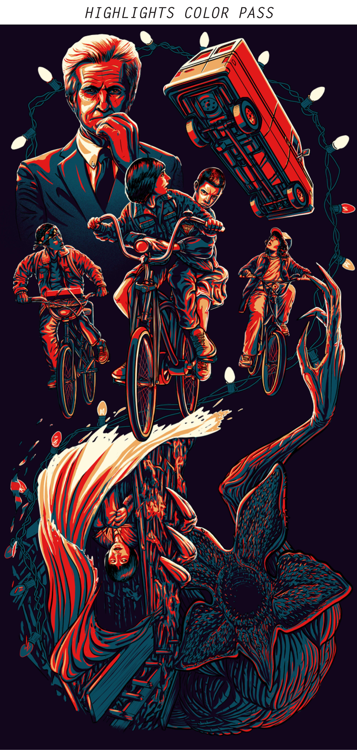
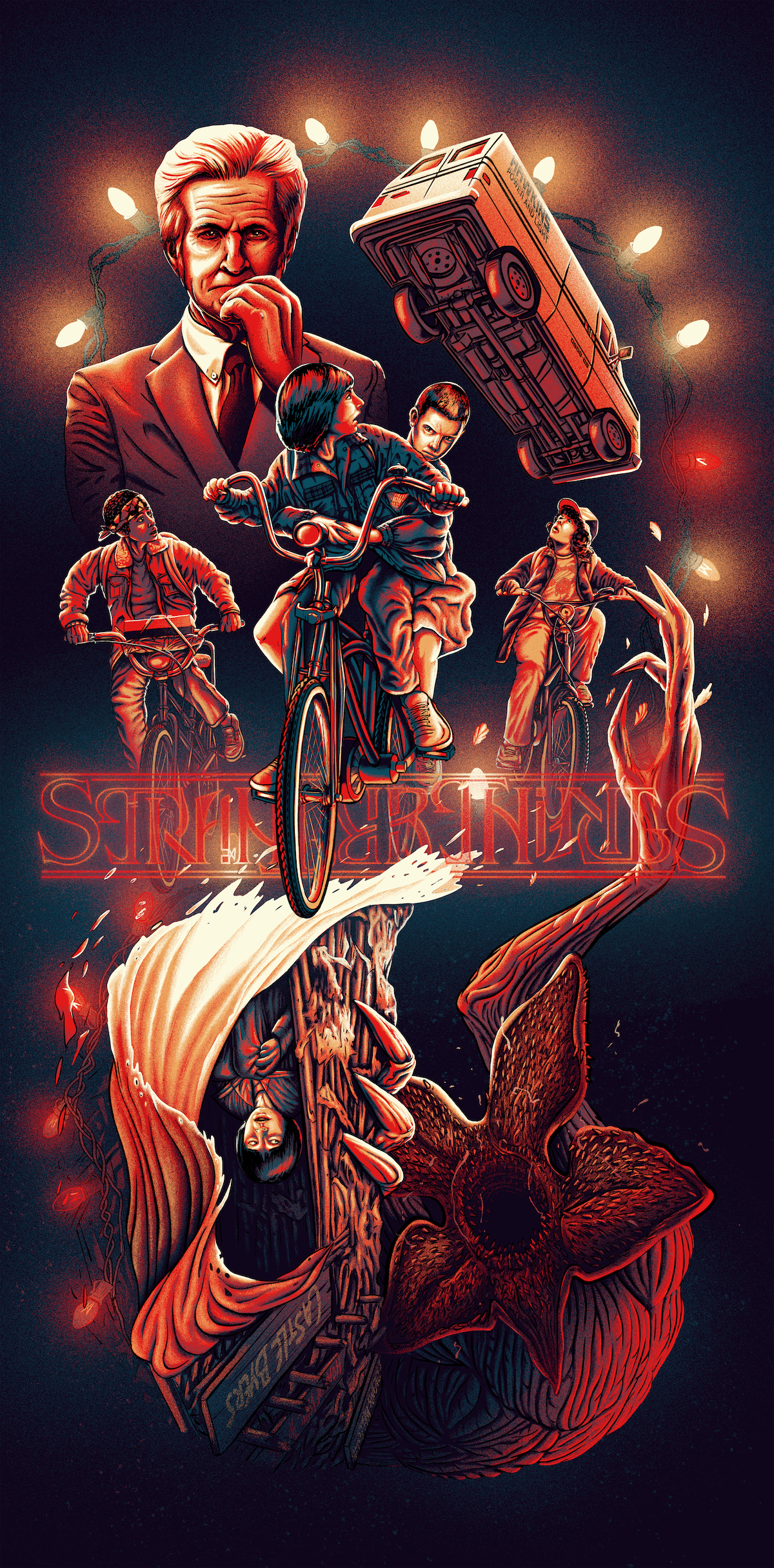
The first season of Netflix's Stranger Things aired just after I moved to Salt Lake City in 2016, quickly became an odd foundational point of interest for wife and I's budding relationship at the time. Years later and despite its flaws, Stranger Things remains among our favorite TV shows, and after season 4 aired in 2022, I feverishly began working on this passion project. With the ambigraphic logo provided by Patrick Scullin, a graphic designer and professor at Riverside College in California, this poster serves as the culmination to everything I've learned up to this point regarding illustration and alternative poster design.
PROCESS & TECHNIQUE
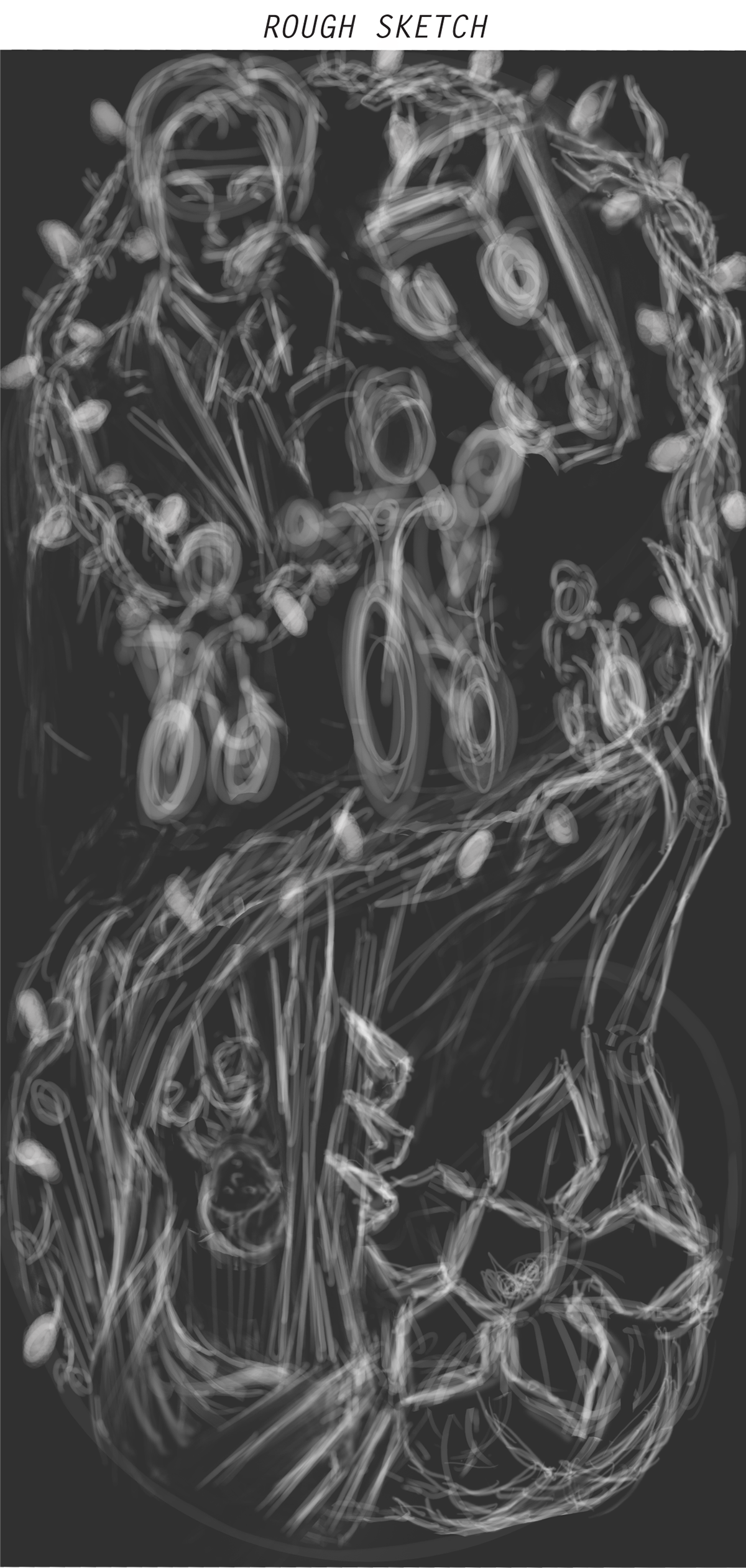
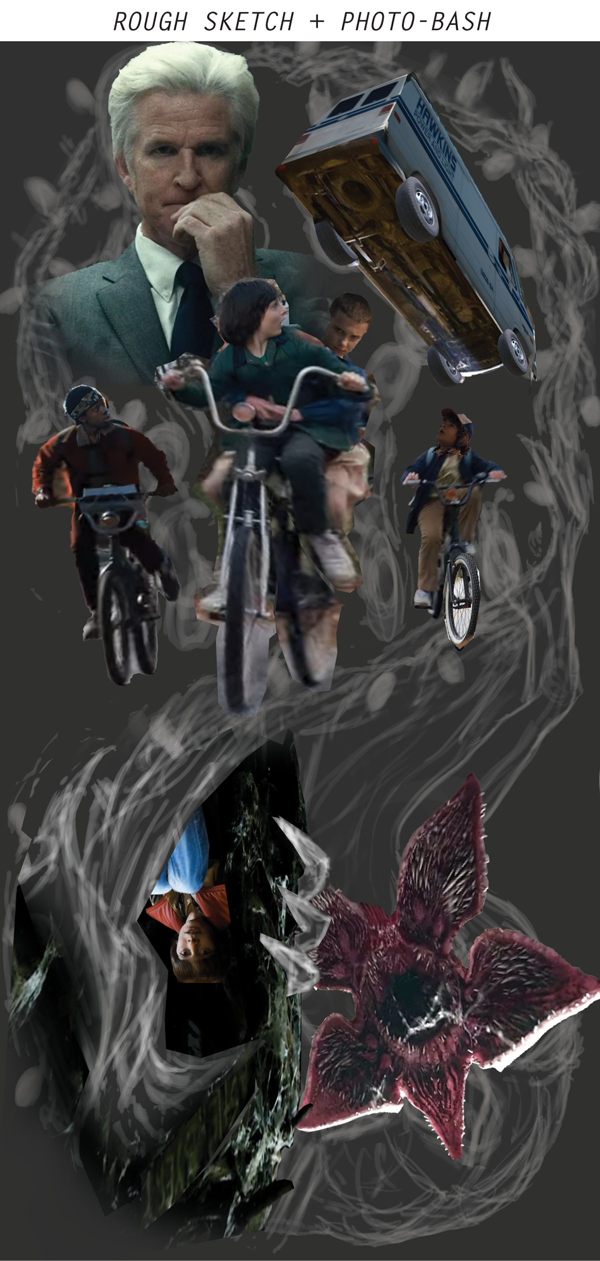
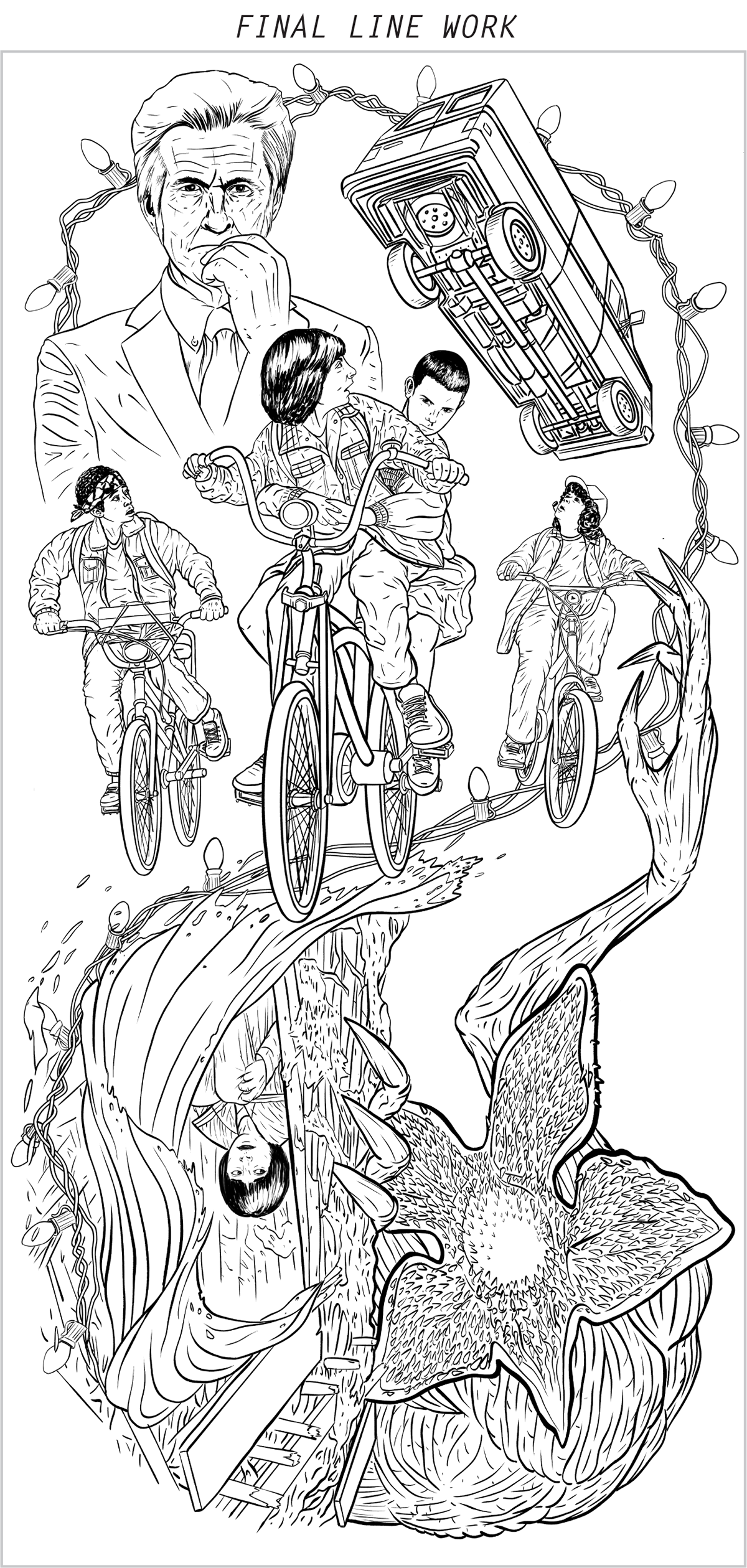
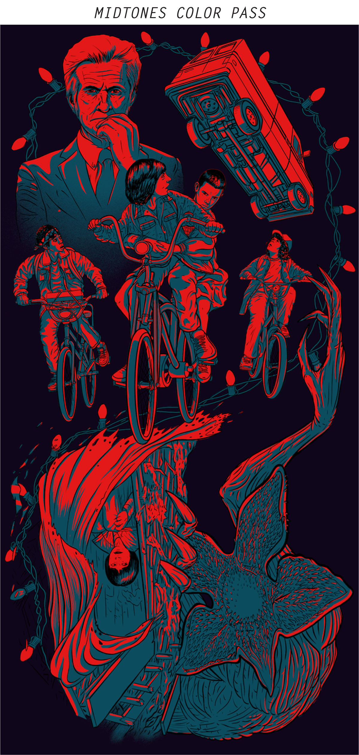
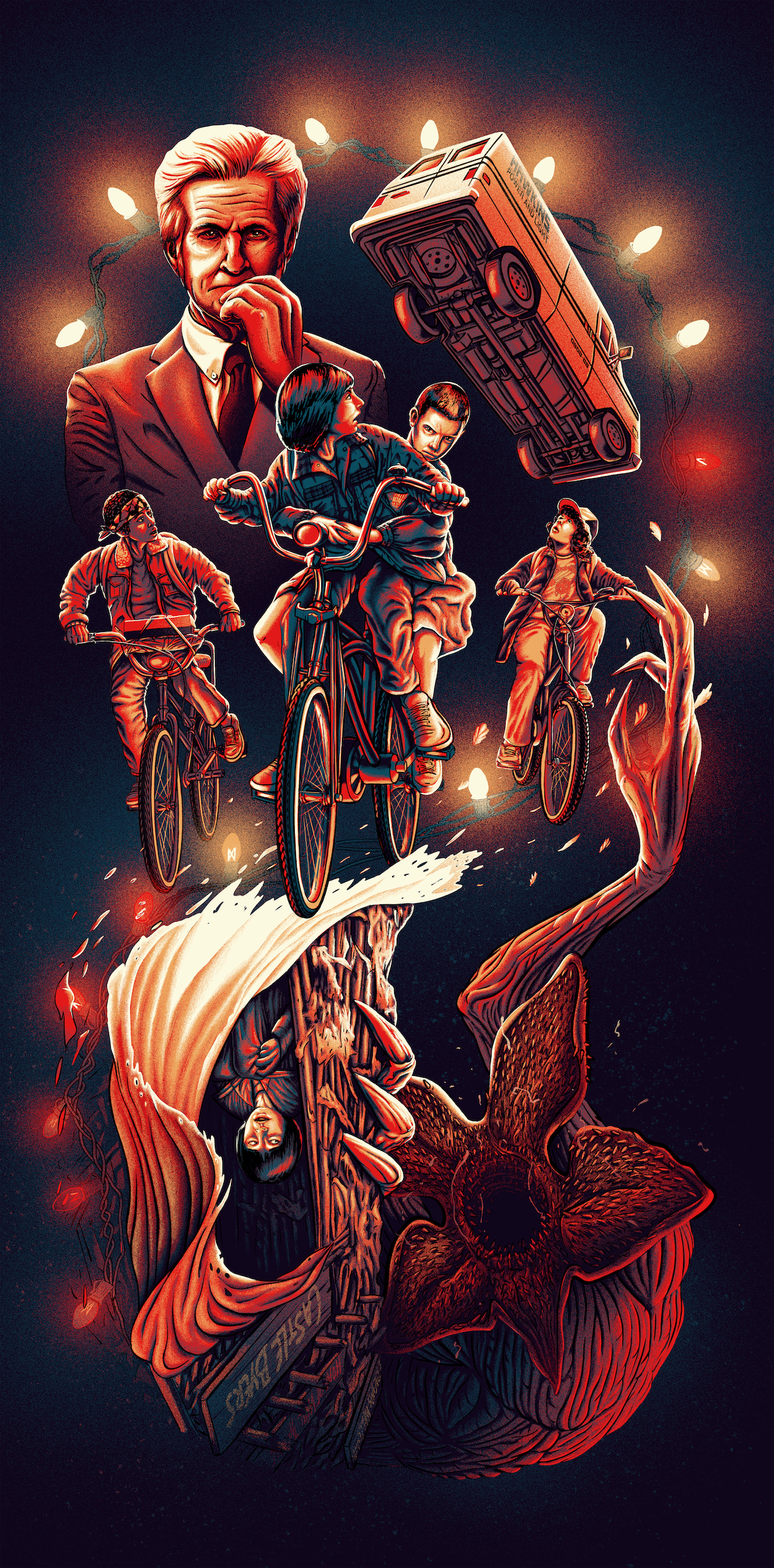
This was a massive project that I completed in my limited free time over a span of months, initially starting out with an rough sketch and then a photo-bash to better understand the layout and composition. From there I developed my line work, starting with a rough draft and then going over it again with a second pass. Lastly I began the colorization process, blocking in the shapes with red, blue, and yellow to invoke colors commonly associated with the show before blending everything together using soft round brushes set to the "Dissolve" blending mode.
TYPE DESIGN PROVIDED BY PATRICK SCULLIN
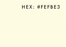
COLOR SCHEME:
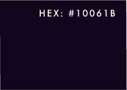
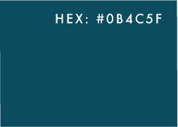
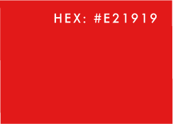
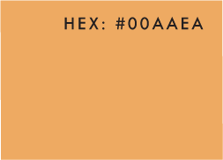
LAYOUT & COMPOSITION
In developing this design I was inspired Martin Ansin's Man of Steel poster and by Aaron Horkey's Lord of the Rings posters for Mondo they did a number of years back (honestly they're incredible, you should seriously look them up if you haven't seen their work before) and knew I wanted to aim for a design that emulated his sense of structure and showcase the "Right-Side-Up"/"Upside-Down" aspects of the show. Using two reflected golden spirals as the basis of my design, I then added the V-shape through the center to provide additional structure. Finally, I made Eleven the center of the composition by literally placing her near the center of the upper spiral and having many of the major lines leading directly toward her face.
